Tuesday 17 February 2015

Favourite Places: Nashville


Oh the Places we Go!

“You have brains in your head. You have feet in your shoes. You can steer yourself any direction you choose. You're on your own. And you know what you know. And YOU are the one who'll decide where to go...” ― Dr. Seuss, Oh, The Places You'll Go!


I love to explore new places...not just travelling to other countries but new local places. Trying new restaurants and bars, exploring boutiques, museums, vintage shops, and local markets inspire me and certainly help the creative juices flow.


Part 1: Nashville

I recently visited a friend in Nashville, and as we all know Nashville is known for its music, and don’t get me wrong we did enjoy some top quality live music and hit up Broadway and it's honky tonk, but it’s the amazing design in this bar, restaurant, coffee shop, and bowling alley that stick out for me… yes, a bowling alley!


Patterson House: Step back to the times of Prohibition and enter the Patterson House. Take a step behind the ceiling to floor grey velvet curtain and enter a “Speakeasy” bar with such a cool, mellow and intimate vibe. The dimly lit interior enhanced by dark chestnut wood and contrasted with sparks of silver and ivory gives the bar a feeling that you have entered a relaxing study or library. In the centre of the room sits the bar, with row upon row of different coloured spirits, bitters and syrups that makes it look like a old-wordly apothecary. The cocktails are incredible, a bit special, like the Bacon Infused Old Fashion. The food is amazing, small plates but worth every bite! It is a very, very cool place!


Check out the metal tiles on the ceiling.


Bacon Infused Old Fashion with real bacon drippings!
(All Images from Flickr)


Virago: An Asian-fusion and sushi restaurant with a hip, Asian inspired design. Dim lanterns, sunken and elevated spaces, tiger wood paneling, a ceiling of chopsticks, exposed brick, glass tiles, and polished stone floors, are all part of the this zen-like interior that gives this space an upscale trendy feel. I ordered sushi and sake, as good sushi is nonexistent where I live. It certainly wasn’t the best sushi I’ve ever had, as I was spoiled living on the Californian coast for 8 years, but it wasn’t bad either, and probably the best in Nashville. It certainly deserves a big roar for creativity! Check out the “Bomb” … shrimp tempura, avocado and asparagus topped with baked jumbo lump crab and spicy mayo! The chilled sake menu is incredible, apparently most extensive sake inventory in Nashville. So take your pick!


Recycled cardboard lamps by Graypants. Image credit Build LLC


The Bomb! (Image courtesy of The Spinach Tiger)


Pinewood Social: I’m not sure I can put down in words how utterly awesome this place is…but I will try. My friend told me that we were going bowling and we’d grab some lunch. I imagined smelly shoes, a juke box that played 70’s disco, cheap beer, greasy food, and everywhere having that lingering smell of cigarettes. (This may have appealed to me at some point but I like to think I’m a bit more sophisticated these days.) Holy moly, was I wrong! It’s a coffee shop, restaurant, bar, internet café, bowling alley, karaoke lounge, pool, and bocce ball court all packaged into one large converted trolley barn, and everything is done absolutely spot on! It’s probably one of the most inspiring places I have ever been, in terms of interior décor. The food and drink are also a first class culinary experience. We had reservations (you need reservations!) for bowling and nestled in the back is a 6 lane retro bowling alley. The lanes are made from reclaimed pinewood, hence the name, from an old, forgotten Bowl a Rama, and the old school ball return, and scoring system make this have an uber cool vintage vibe! The neon sign and the huge mural/art installation are the icing on the cake, or the strike to the spare!

The whole concept of this place is truly inspiring. In an interview with Forbes Travel Guide, Ben Goldberg explains that his inspiration came from The Great Good Place, a book by Ray Oldenburg that explores the importance of public gathering spaces… “The book talks about how, in America, most people’s lives are centered around going to work and going home. But in other countries, people have this dynamic third space, whether it’s a park, pub or shop — somewhere they hang out outside of their work and their home. The book argues that there’s more to life than going home with your family and going to work with your co-workers and that, if you’re able to find a third space that’s dynamic enough and you can meet and engage with people there, your life tends to be happier.” My friend and I definitely found our third space for the day! Whether you want to eat, relax, drink, bowl, swim, or sing, this place has something for everyone.

The entrance that was an old trolley barn (Image: Jeff Stamper)

A large table that houses plugs for charging laptops, ipads, phones, etc. (Image: Matt Harrington)

(Image: Jeff Stamper)

The retro bowling alley (Image from Flickr: Josh Bassett)


Artwork by and image credit Isle of Printing
According to the Isle of Printing website, this large scale social experiment can be easily changed and each month the cans will be rearranged to form a new pattern. So cool!!!
"Change is inevitable and that is the point." - Isle of Printing


The retro bowling alley (Image from Flickr: Josh Bassett)


The super cool bowling socks and shoes!

If you don't want to use the old fashioned scoring system..use an Ipad!


Edgehill Café: An eclectic, industrial, quaint, mish-mash (is this a word? You know what I mean..) of a coffee shop right in the heart of Music Row. Large windows light up the space and highlight the perfect mix of wood paneling and stained concrete floors. The space is softened with huge wingback chairs and cushions upholstered with burlap coffee bean sacks! I love it! The bare drop lightbulbs, to blown glass, and shades that look like vintage milk bottles add to the homey feel where you can find your own nook and work, relax, chat, drink coffee, or eat as long as you want! I’ve not mentioned the food yet… I had the Grilled PBCB. Are you ready for this?.... Peanut butter, chocolate and banana sandwich pan grilled to perfection between 2 slices of sourdough. That’s right. And I ate it all! The menu is extensive serving both savoury and sweet breakfast items, as well as some incredible lunches. The coffee is also very creative, for example the Hiyah! which is coffee plus 2 shots of espresso, with hazelnut, cinnamon, and steamed half and half. I had a plain ol’ iced Americano, which is obviously not creative, but very easy to mess up. The lovely barista made a most-excellent iced Americano with a just a perfect drop of milk!


PBCB! Im getting hungry just looking at this!

Have you been to Nashville? What are some of your favourite places?


Friday 6 February 2015


My love of Pink!

Jem and the Holograms, Tarina Tarantino, Betsey Johnson, Elsa Sciaparelli, Sophia Webster and, of course Barbie... these are my shocking pink heroes!


Pink has traditionally been thought of as a feminine colour, but I find it be very empowering and versatile. 

In color psychology, pink is a sign of hope, it inspires warm and comforting feelings, and the deeper the pink, the more passion and energy it shows. Combining pink with other darker colors such as dark blue, dark green, black or gray, adds strength and sophistication to this colour.

In honor of my favourite colour, I thought I would give some helpful tips on using this oh so roarsome colour in your interior scheme.

Decorating with hot, bold, bright pink can be tricky, but think small and powerful, (like me!) and you can’t go wrong.

When used right, hot pink is an amazing accent colour and can bring life in to your interior.

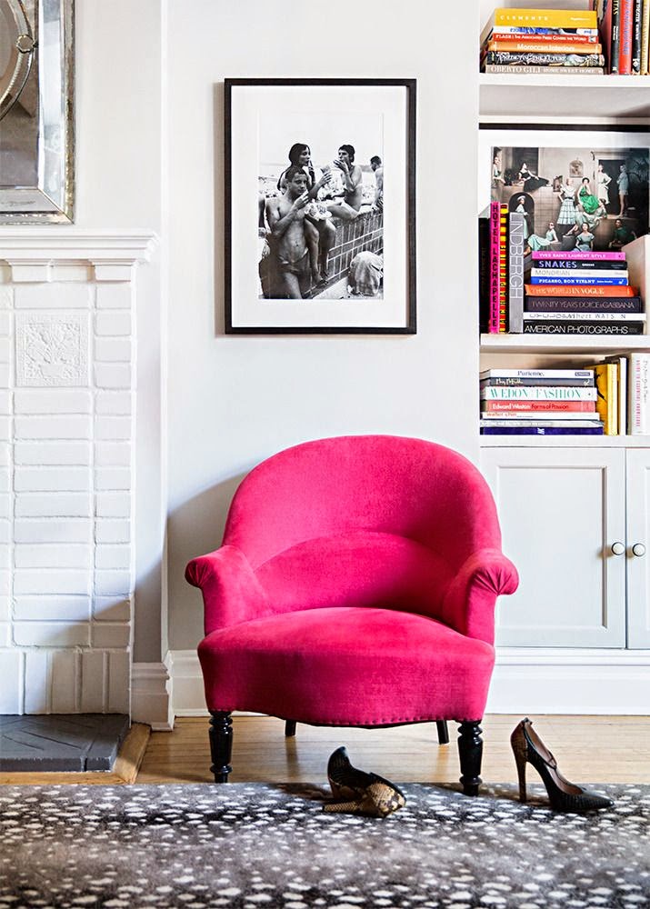
Try adding a piece of pink furniture to your room to make a statement, or painting an accent wall, or if you don’t want to make such a big commitment cushions, vases, or even a chandelier in bright pink will add energy to an otherwise calm room.


Try using bright pink with softer colours, like a pale pink, soft grey, or taupe for a more subtle approach or alternately use with darker colours for a more dramatic statement.


One of my favourite ways to use hot pink is to mix with gold for a sophisticated yet fun look.


Let me know how you get on, and please share your tips and secrets for decorating with bold and bright colours.

Wednesday 4 February 2015

Heimtextil 2015: Trends Theme Park


Heimtextil 2015: Trends Theme Park

“Experience: We are People, not Consumers.”


Heimtextil seemed bigger than ever this year, and rightly so, as more than 68,000 trade visitors attended and 2,759 exhibitors from 68 countries participated in the world's leading trade fair for home textiles. The sheer size of it is absolutely staggering, and according to my fitness app I averages about 6 miles of walking a a day.

As it’s the first major exhibition for home textiles of the year, Heimtextil is considered a major player in forecasting the trends and colours to come.  This year, the trends area was a true spectacle and my favourite part of the whole show. The organizers revamped the old Trend Forum into a new and exciting Trends Theme Park… the name says it all! 

This year the Theme Park was entitled “Experience.”

I attended a presentation by Anne Marie Commandeur of the trend agency The Stijlinstituut Amsterdam who explained the concept and thoughts behind “Experience.” She explained that as our world is changing so rapidly, our needs change as well. To reflect this we need a new way of viewing interiors, which is through experience. In an age where the digital world is becoming more prevalent, our environments are becoming more sterile and less emotional, the more we long for an environment where we can feel good. Interiors should be experienced by all the sense with the use of new and innovative materials and colour.


The four main themes at the park where Sensory, Mixology, Discovery, and Memory.

The Sensory themes appeals to our senses and draws on tactile materials. These materials raged from light, soft, transparent, to furry, and bobbly, and are inspired by health, beauty, and well-being. The colours used in this theme are soft pastels with touches of brightness to lift and invigorate, and fabrics that are going to make us feel safe and warm.


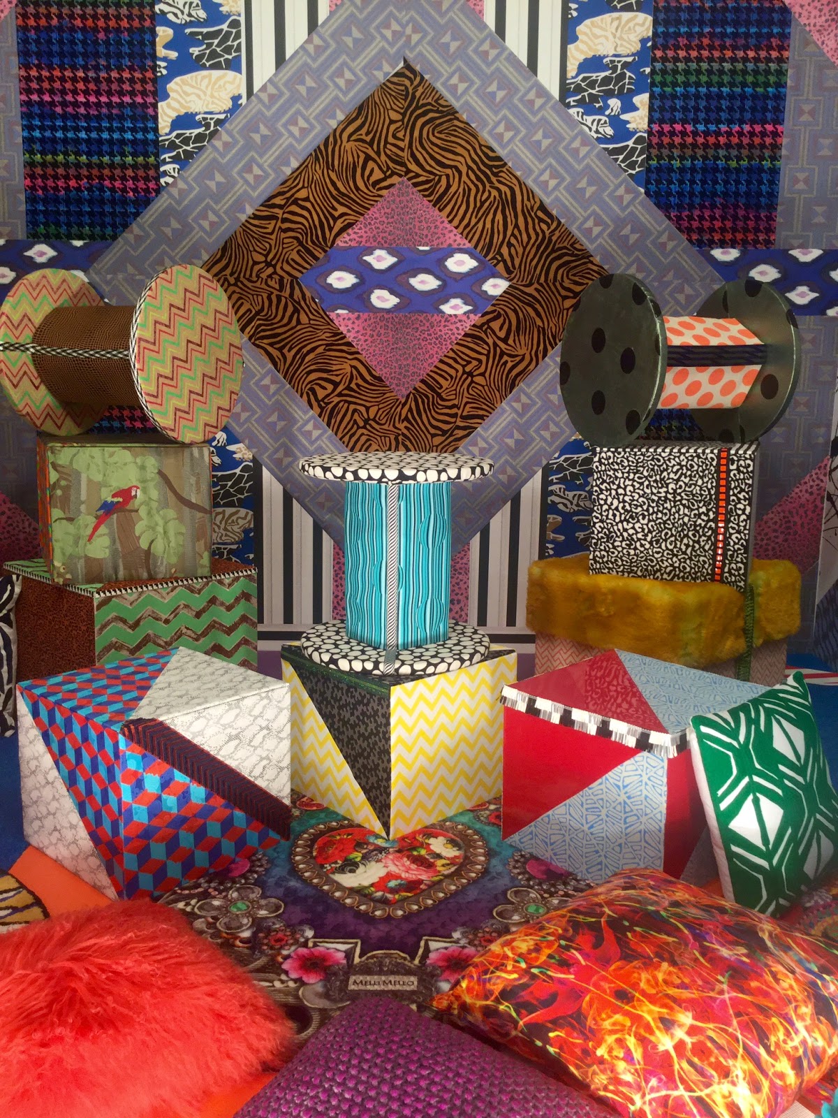
Mixology refers to variety and cultural fusion, a melting pot. According to Ms Commendeur, "Patterns, prints and colours collide almost chaotically with each other. African tribal design meets 3D rave motifs, retro with futuristic, digital with organic." This in turn leads to the idea of upcycling and recycling. Bold, bright, vivid colours enhance this theme.


Discovery to me is a step onward from the Sensory theme, where we look into the future to see how we can use our planets resources and the digital age to enhance materials. Material is enhanced by the addition of ornamentation or finishes to give different dimensions and aspects from varying perspectives. Light is used to illuminate and dazzle these materials, such as sequins, metallic, and holographic. Futuristic colours are used to illustrate this theme further, such as silver, gold, copper, and liquid like materials on varying fabric structures.


Memory is about reflections and re-evaluation, where as we continue to use modern technology in our environments we must not forget about our past. Design must 'combine handicrafts and tradition with an innovative sense for modernity whereby their software abilities are an additional benefit," according to Ms. Commendeur. We must appreciate our heritage. The use of denim, linens, and wool as well, as florals and other similar patterns are used to enhance this theme. 


Dandylion Designs | Bloglovin' - Facebook - Twitter - Pinterest